


Visit the website www.thecoffeecity.com to learn more.
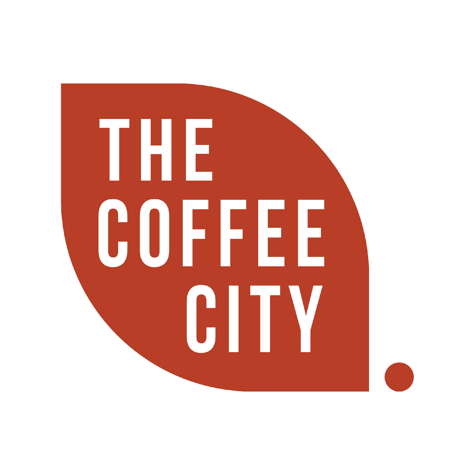
The logo is minimalistic, eye-catching, and easy to remember. This is a representation of where all begins. The logo represents the coffee plant leaf ready to be harvested with a red cherry, followed by the brand name.
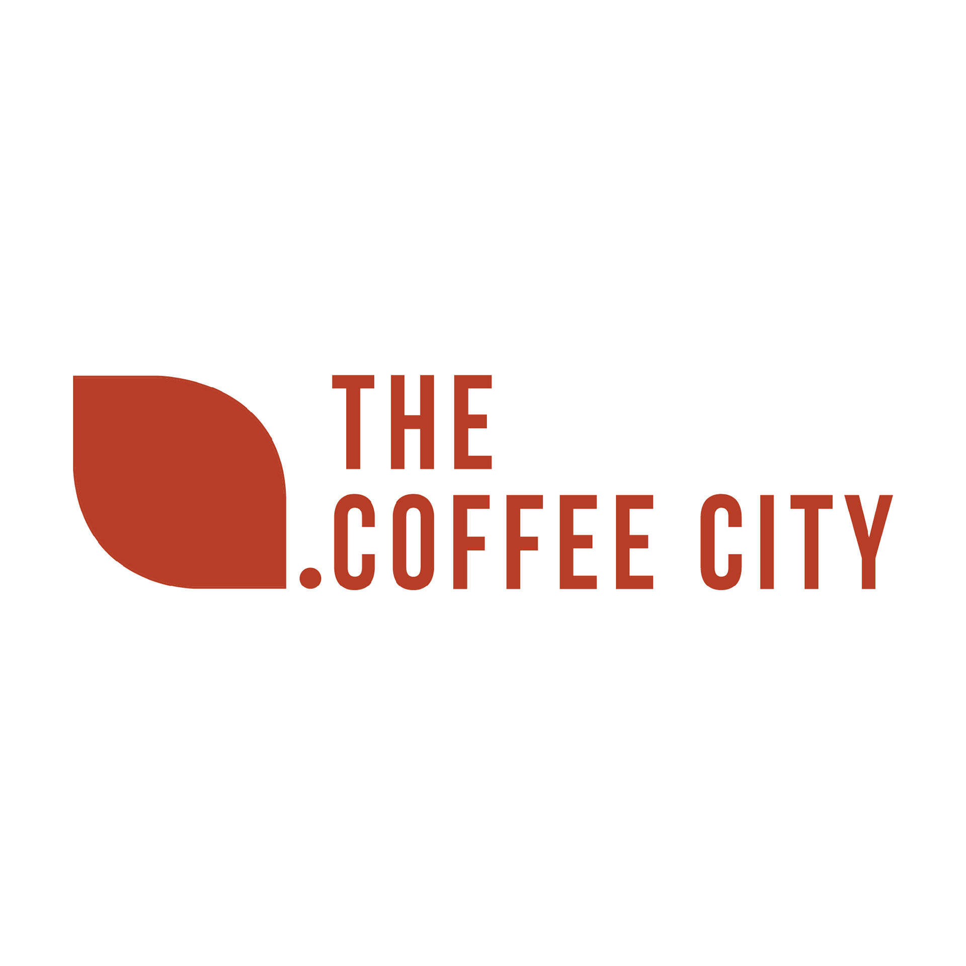
The main logo is the vertical version but a horizontal logo variation was created. This helps the brand be flexible and keep its visual identity when needed.
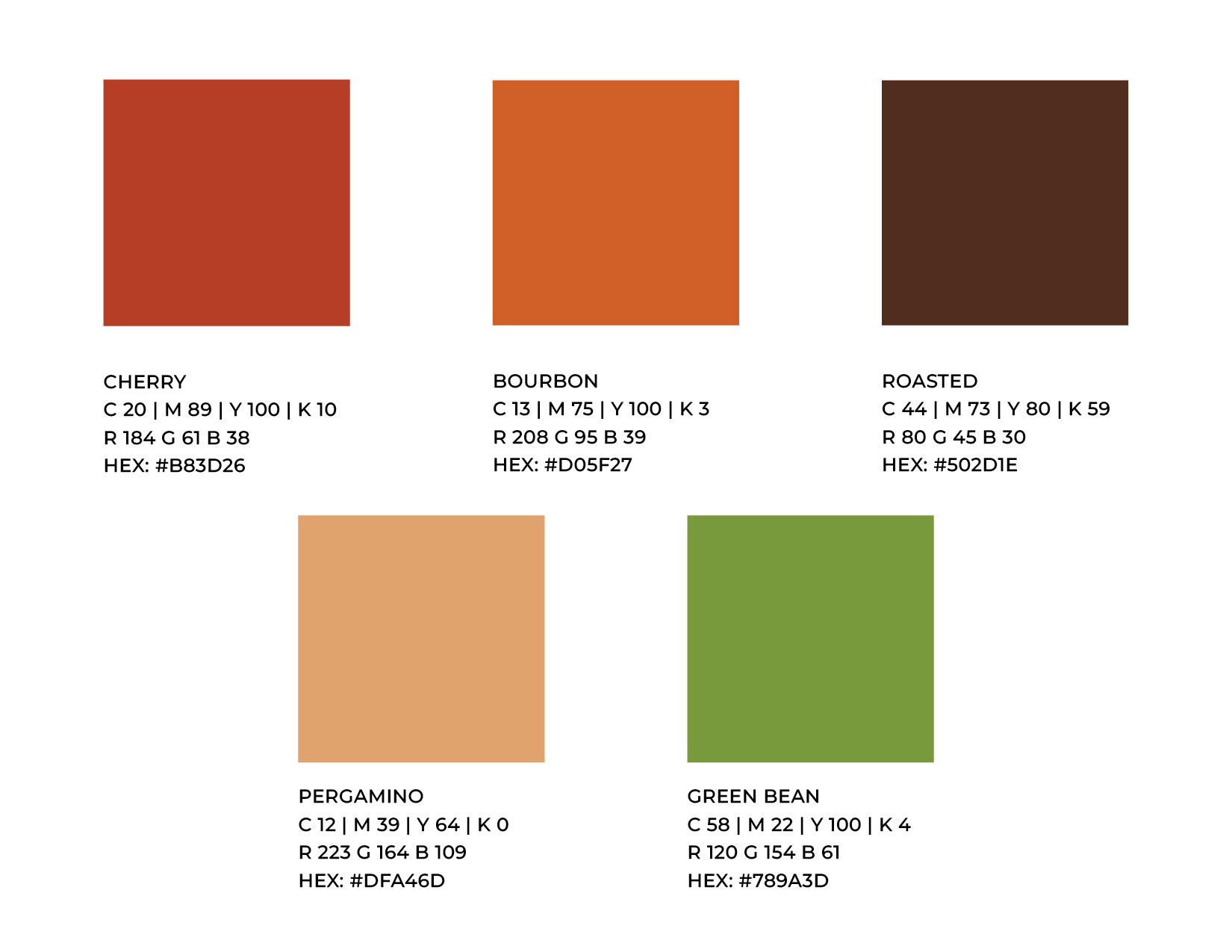
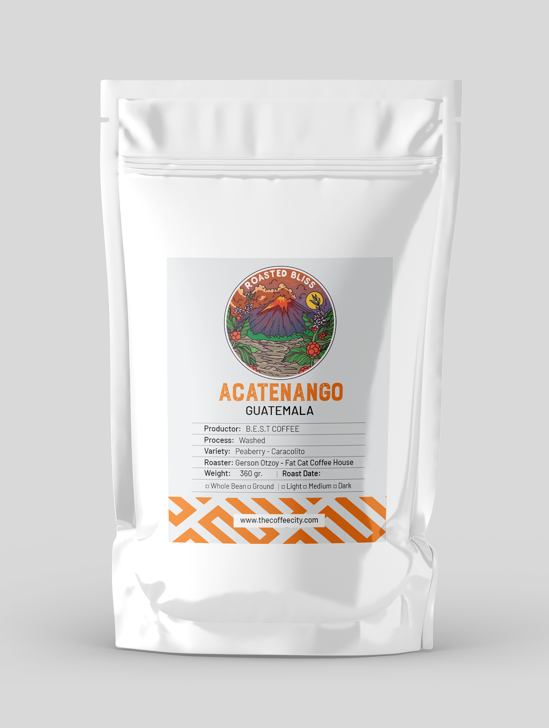
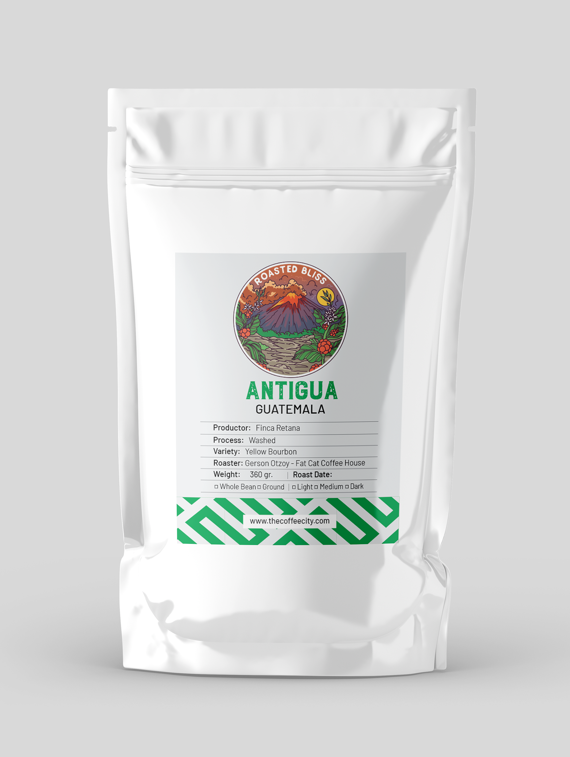
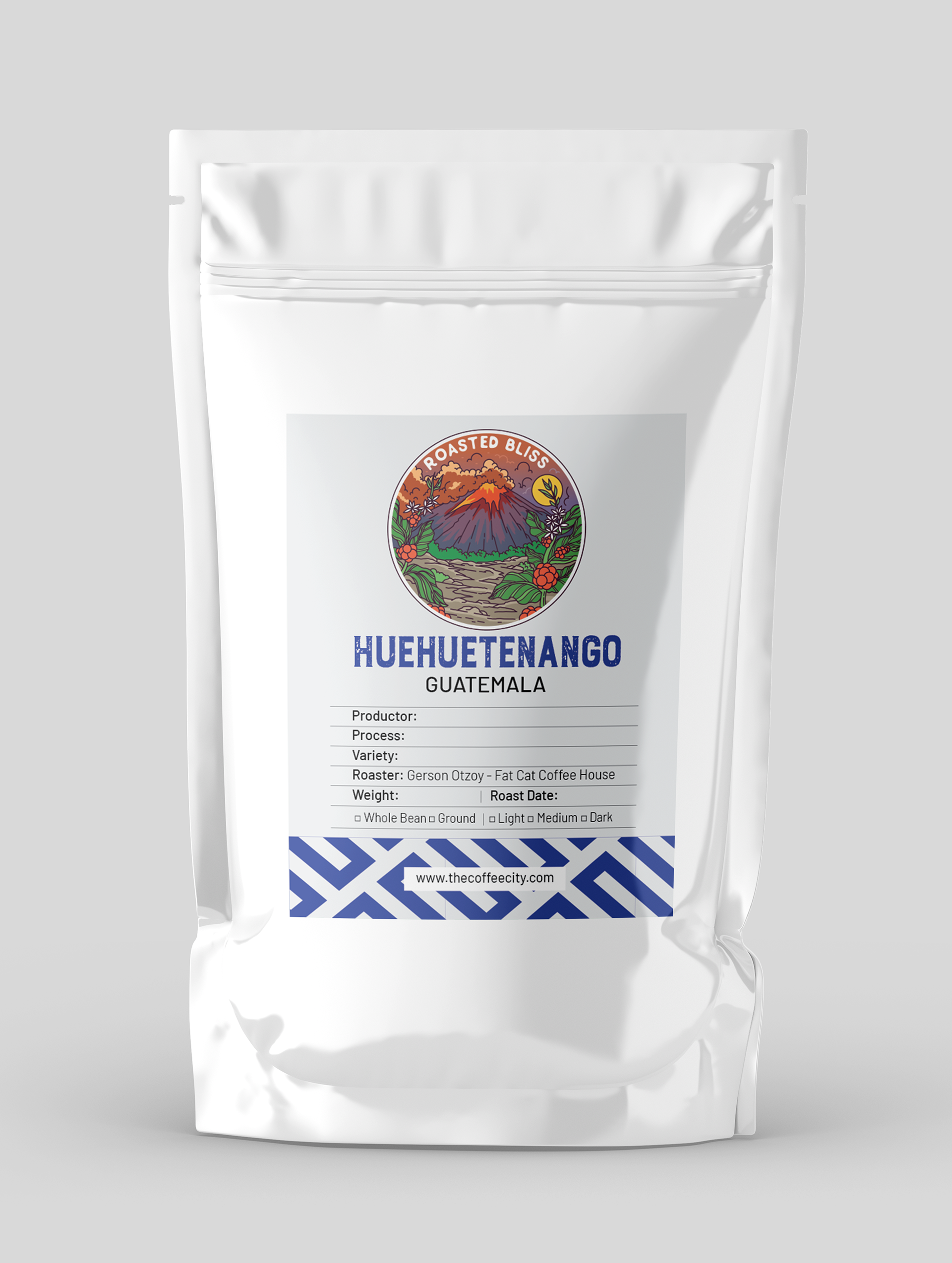
The color palette is a representation of the coffee plant. The orange and green represent what is called the cherry and its different stages up to the red when the cherry is ready to be harvested and the brown colors represent the roasting process of the coffee.
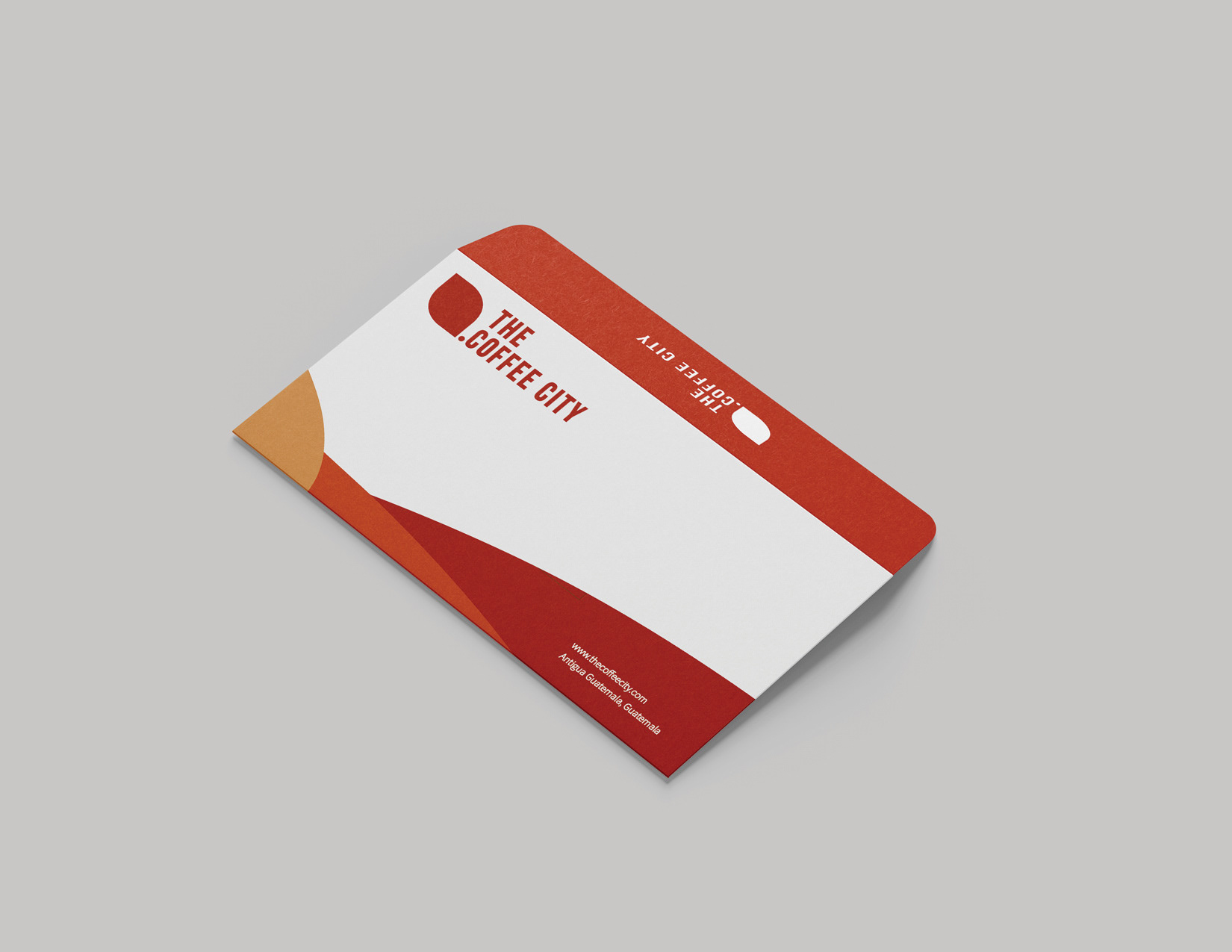

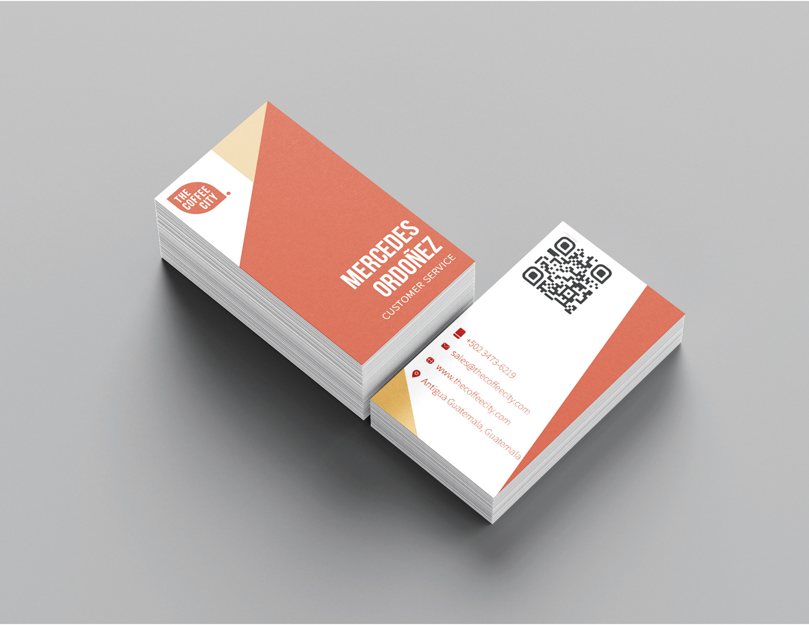
This part of the stationery worked for the brand, keeping its colors and visual identity as much as possible followed by important company contact information.
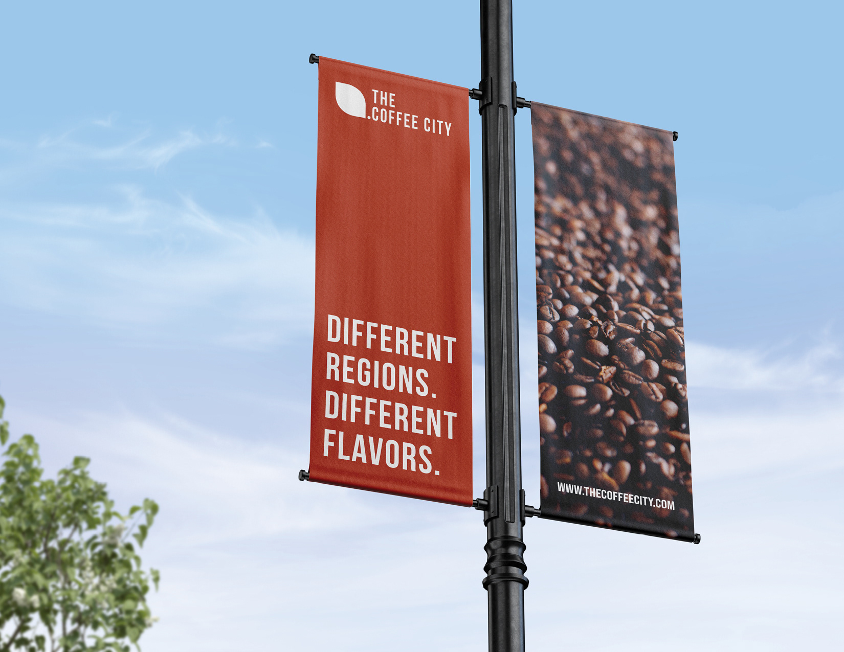
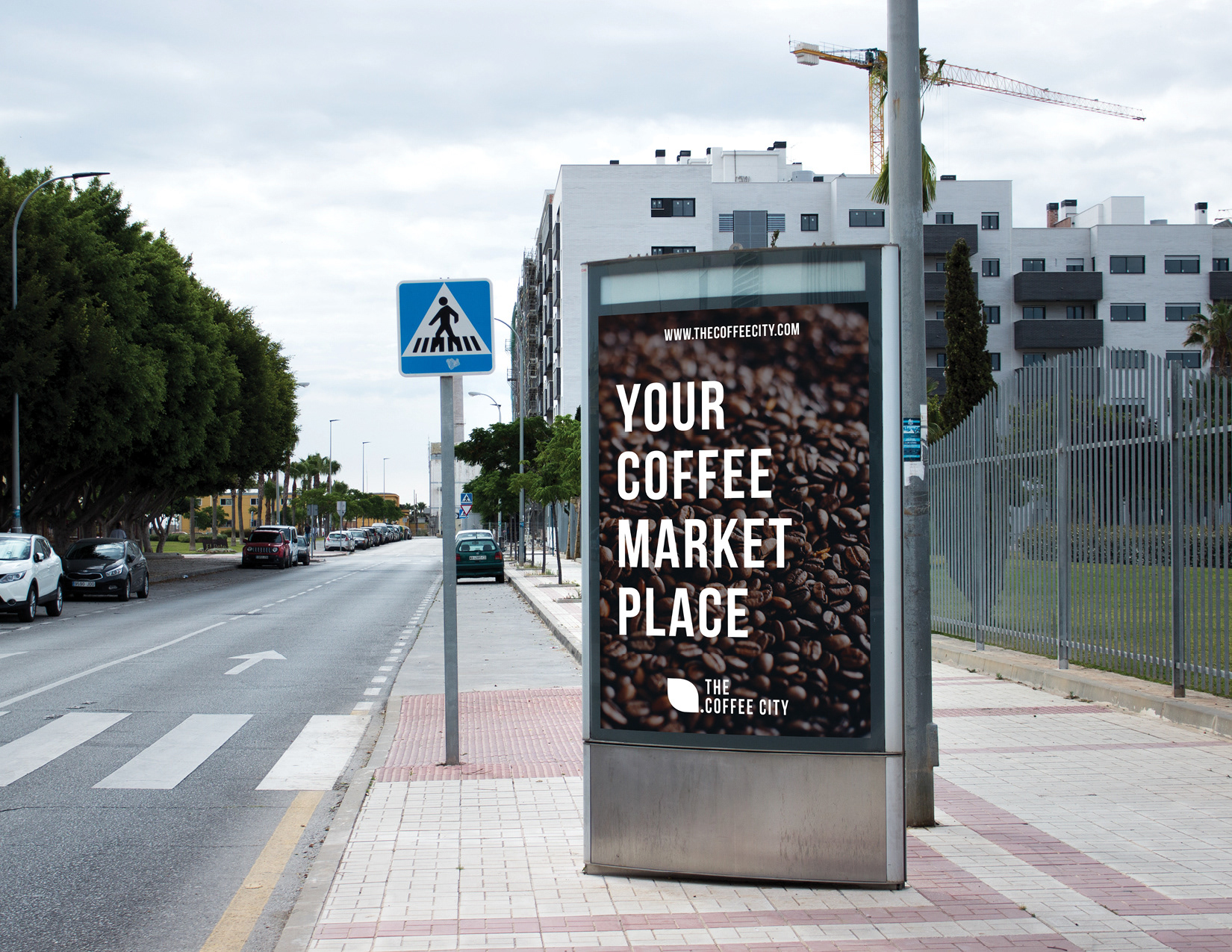
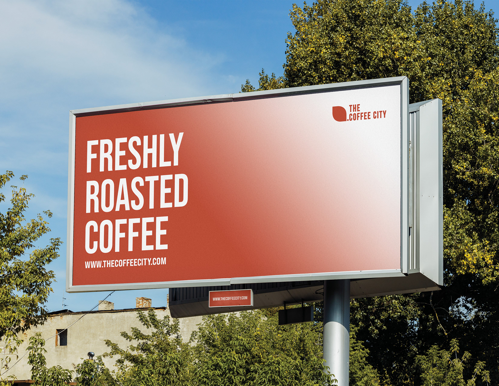
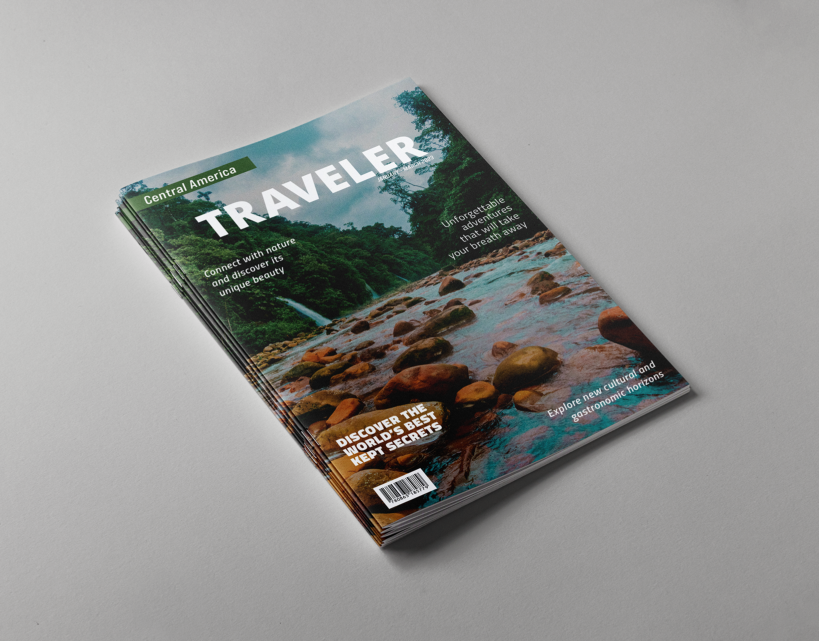
The advertising campaign is designed to share a clear and crisp statement of what The Coffee City stands for and the quality of products it provides.
Software: Illustrator | Photoshop