For DC Bags Guatemala, I had the opportunity to revamp their website, creating a smoother and more user-friendly experience. The client wanted a clean, structured design to help customers explore products and connect with the brand’s story. Here’s a look at how I approached this project:
I started by simplifying the navigation bar for easy browsing, organizing it into sections like Home, All Products, Custom Orders, Our Story, and Contact Us. This structure helps visitors find what they need quickly and encourages a natural flow through the website.
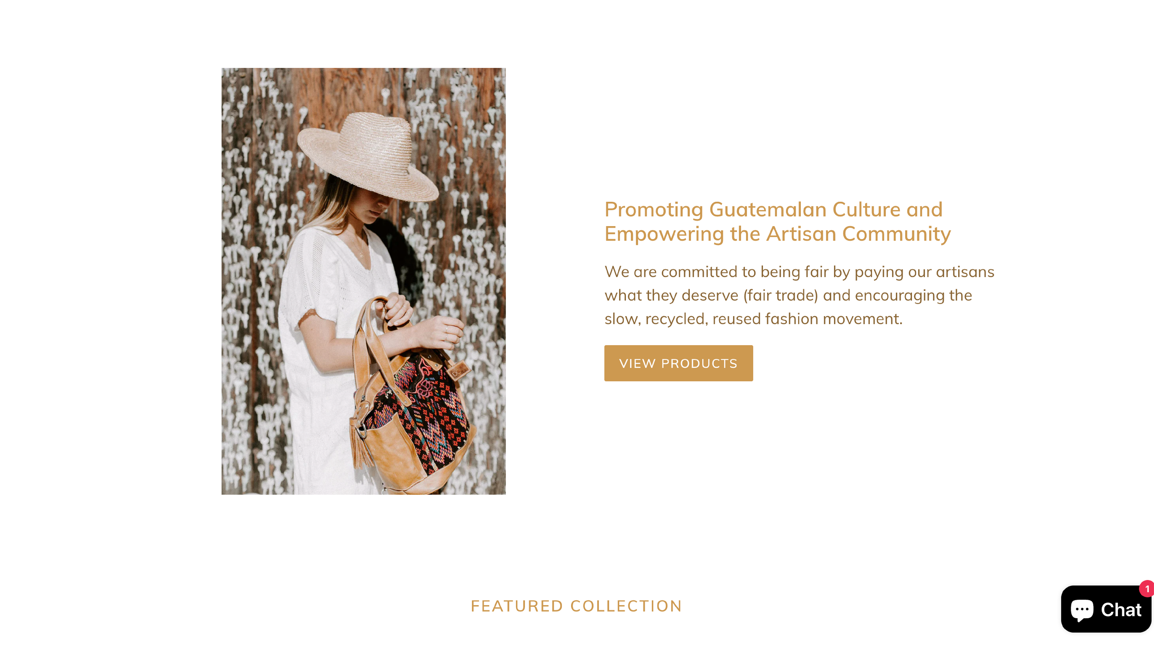
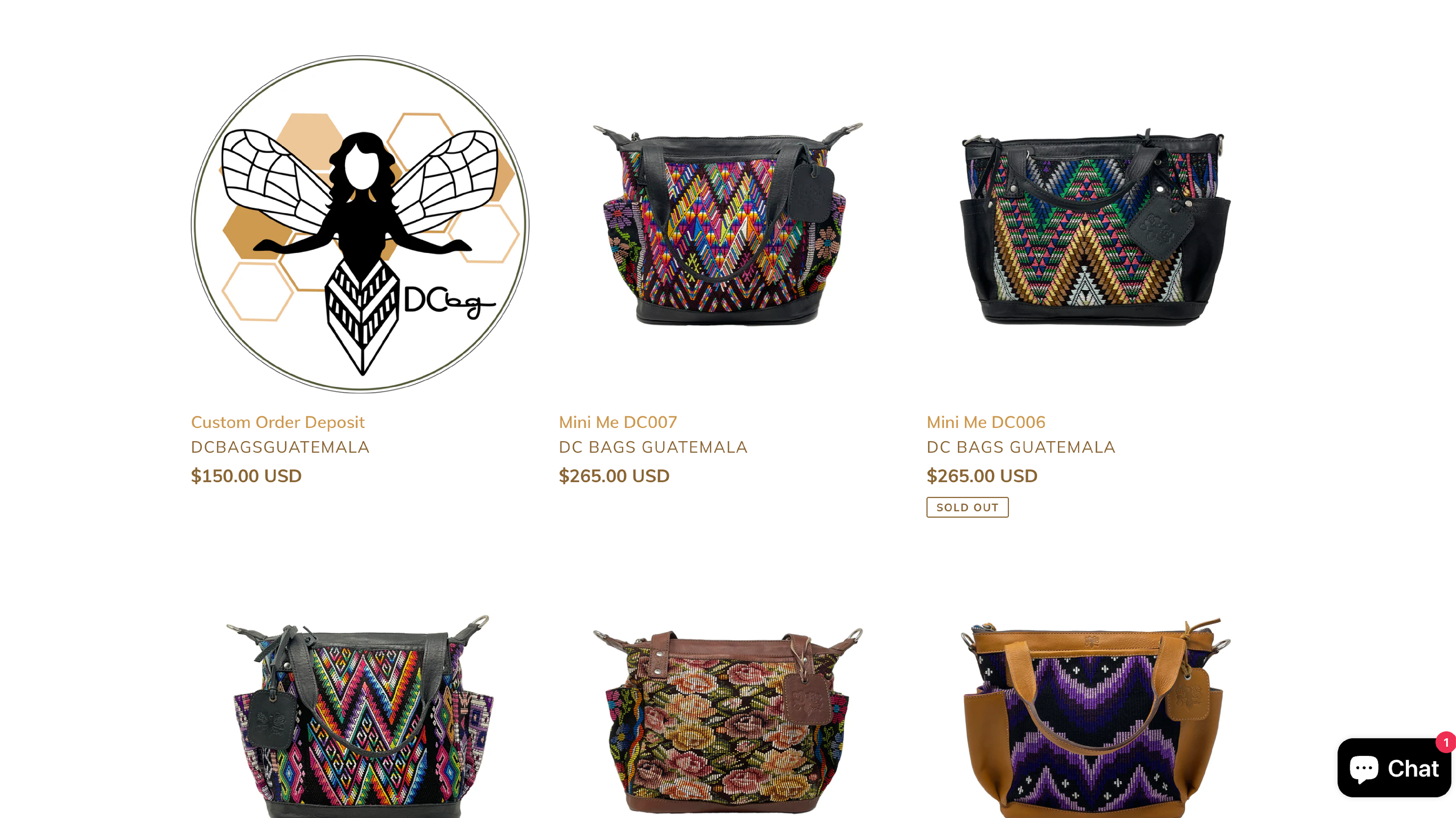
The main page introduces DC Bags, highlighting their story and passion for craftsmanship. I standardized product images on a solid white background for a sleek, professional look across all listings (the client later made some updates to product collections and images).
Each page was thoughtfully restructured to improve content hierarchy, with clear titles, subtitles, and concise text. I revised and expanded on the existing content to give the brand a more approachable and relatable voice, ensuring the client’s ideas came through clearly and engagingly. You can check the website here.


