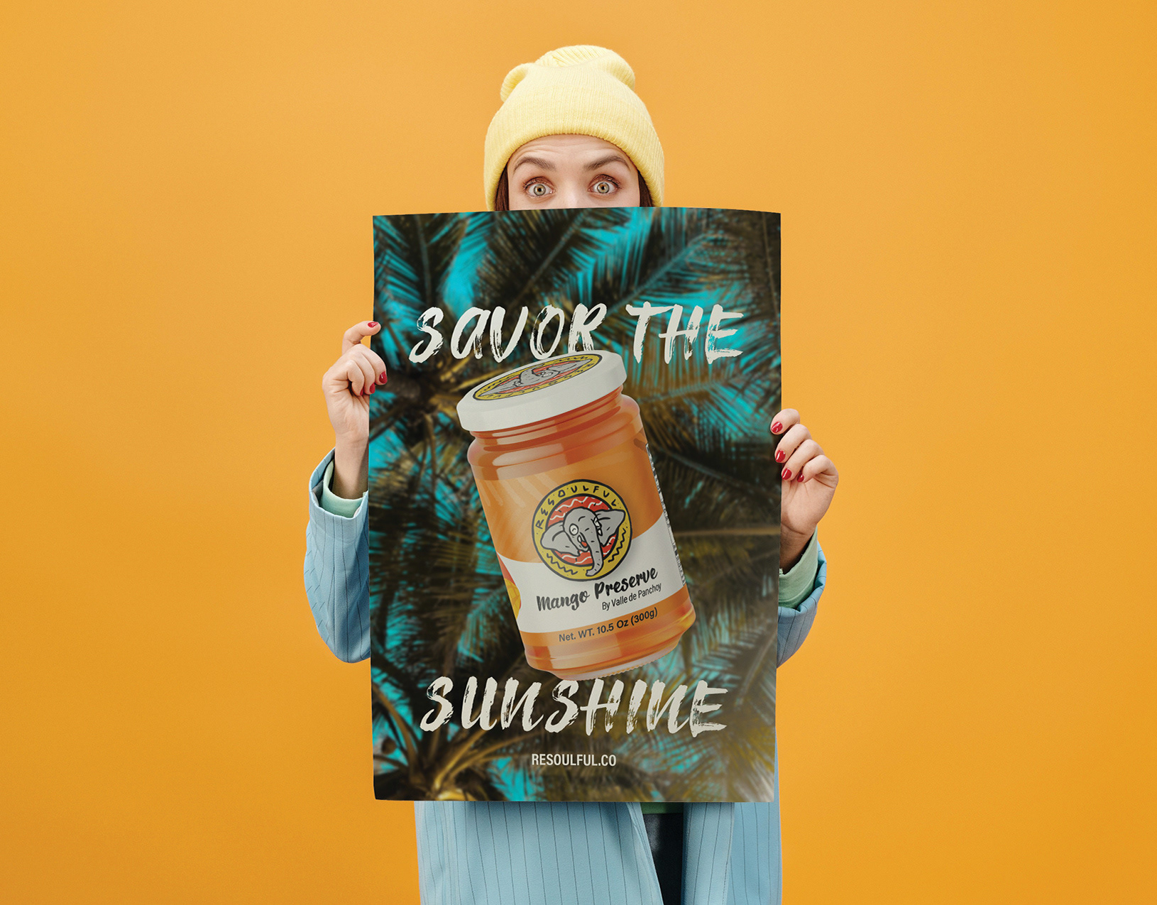


Inspired by a simple material used in the dispatch process, the main graphic element is a box with a set of wings. Generating a modern concept of the visualization of this (box) followed by the brand name.
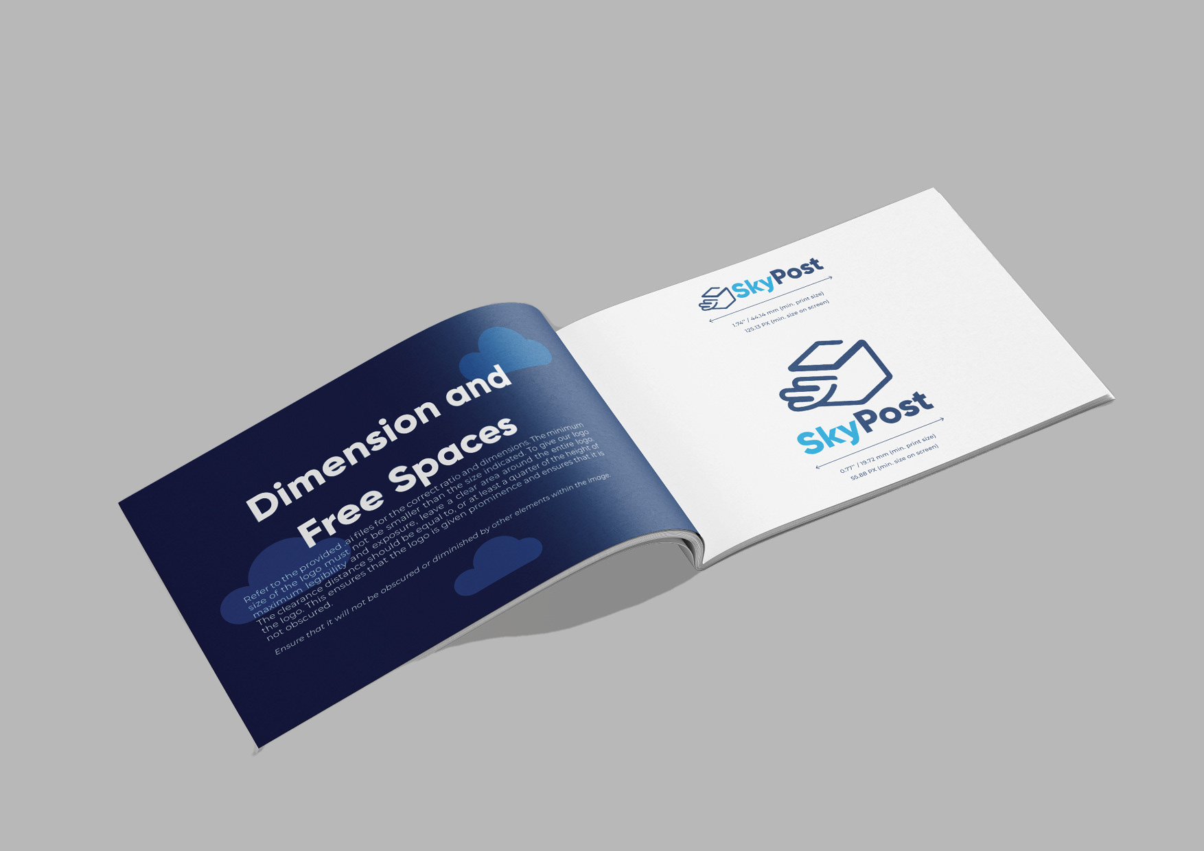
The main logo is the vertical version but a horizontal logo variation was created. To make the brand be flexible and keep its visual identity when needed.
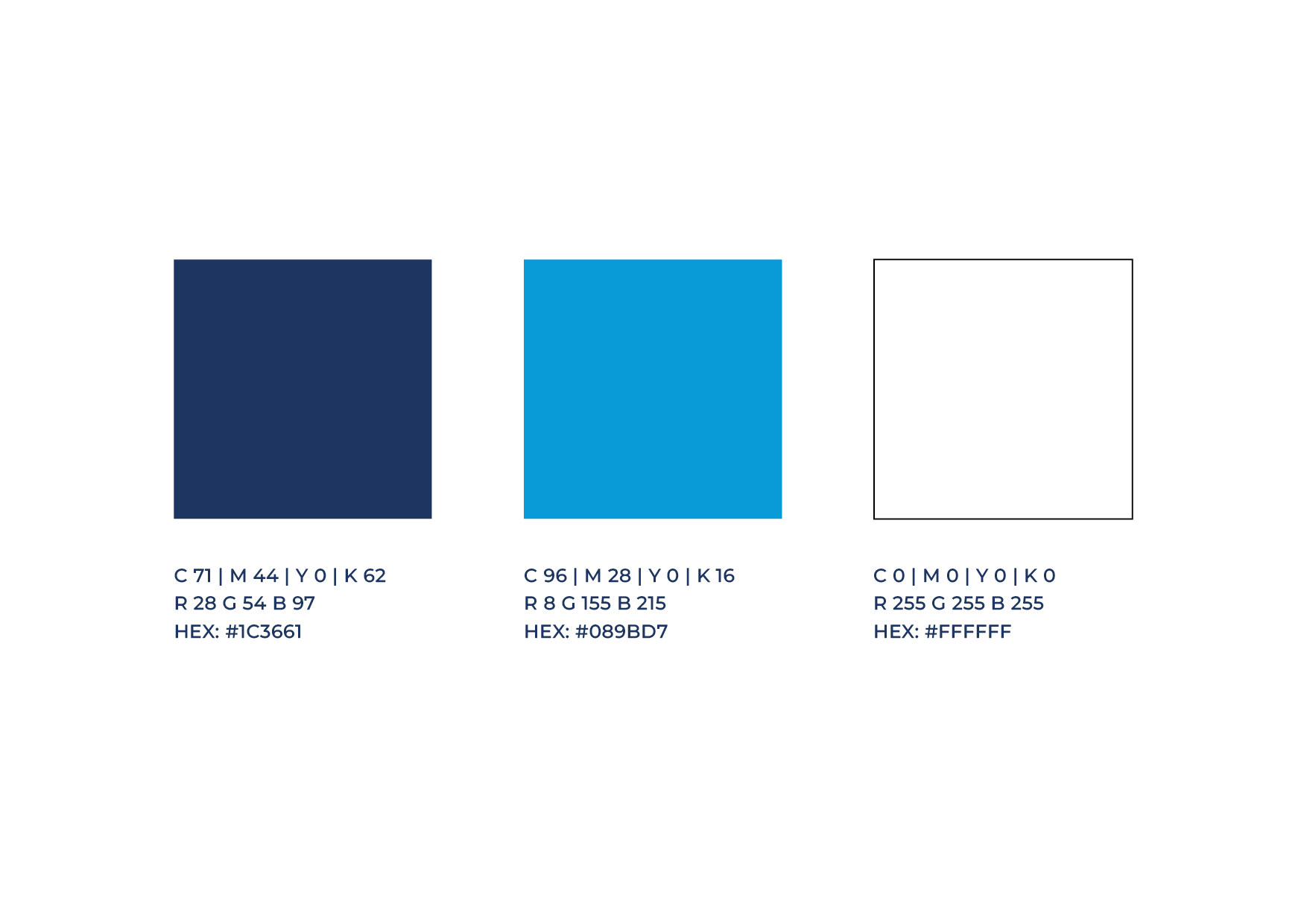
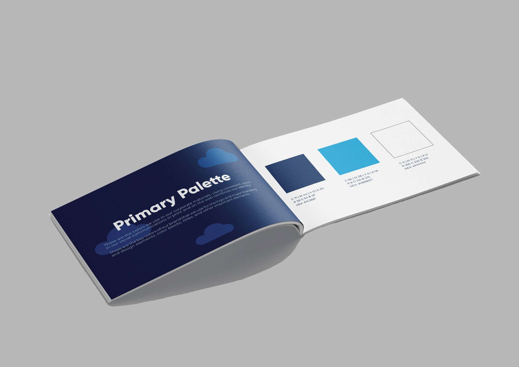
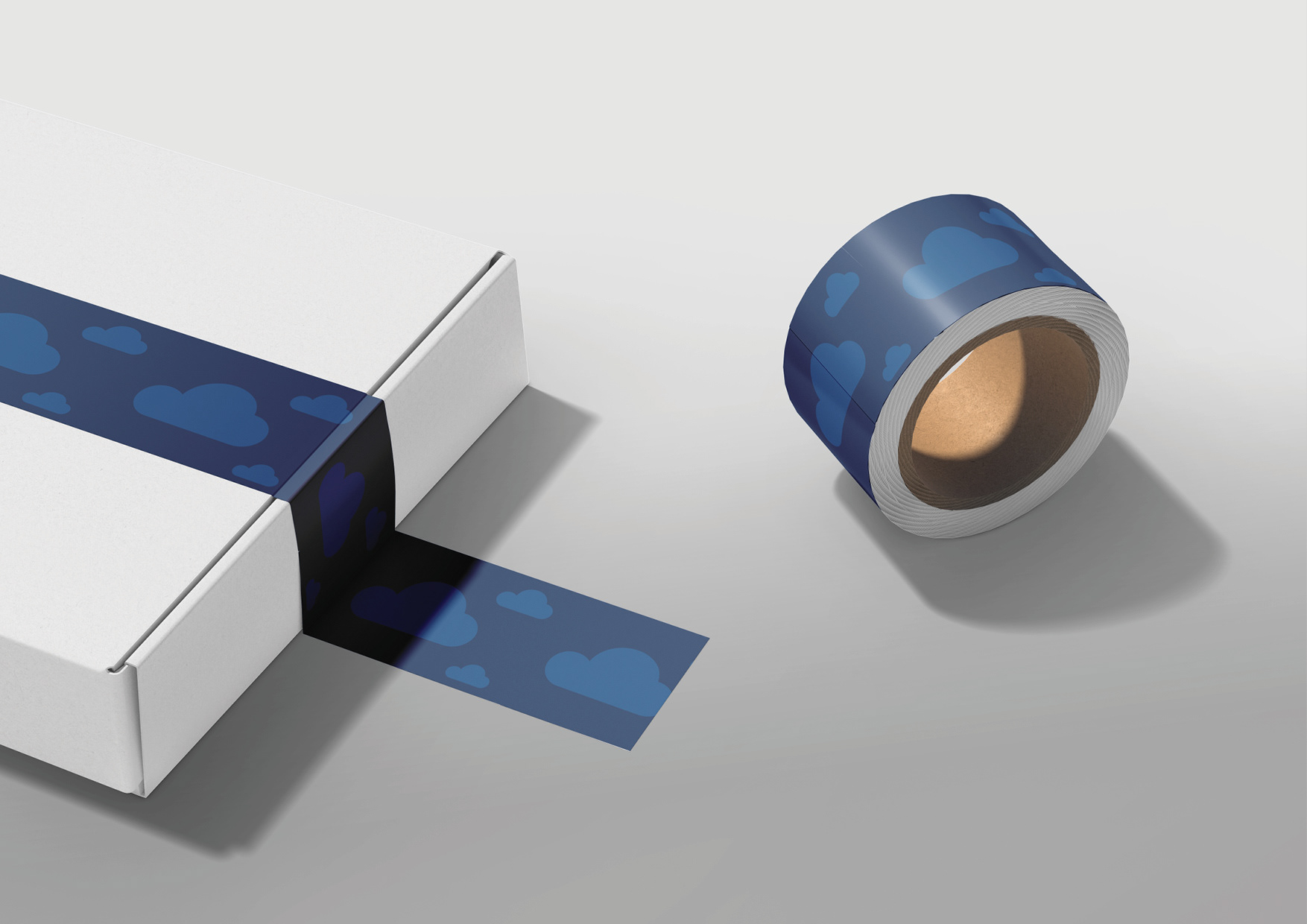
These are the key colors of the brand that we use for the logo and major branding and design elements such as color blocks, titles, and other important elements. These are the colors used for corporate materials.
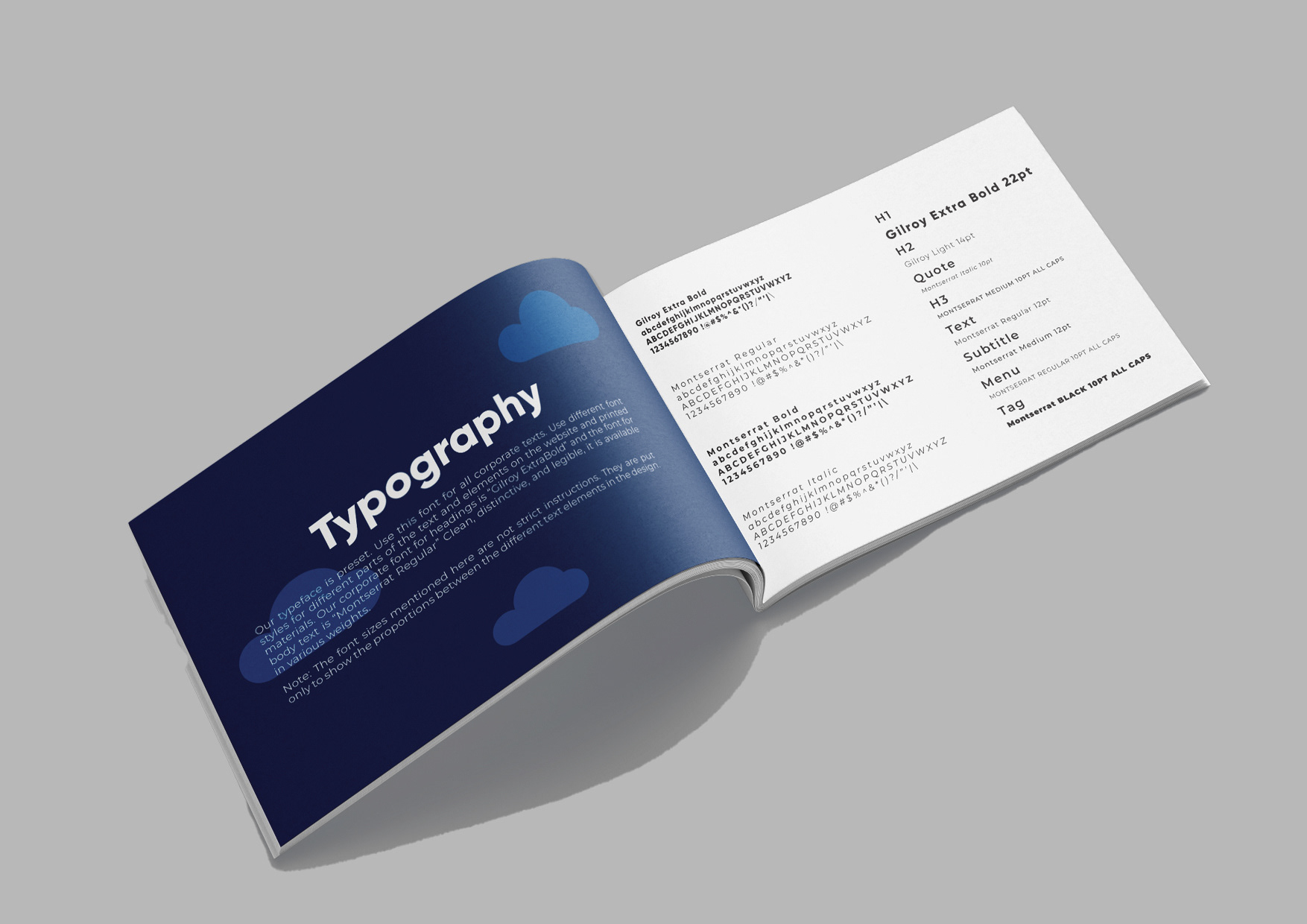
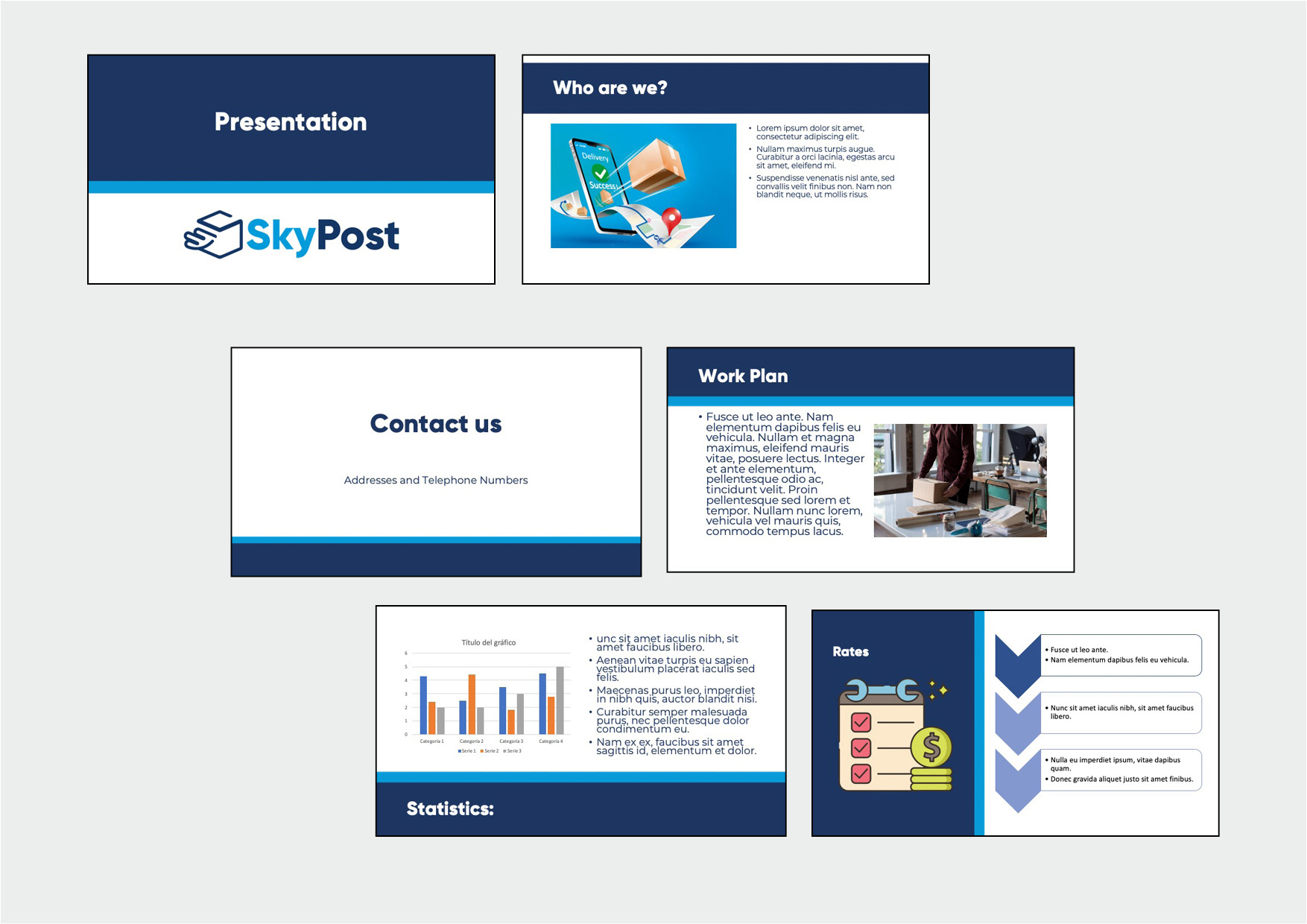
A style guide (or brand book) is a set of rules for writing and designing documents, whether for general use or for a specific publication, organization, or field. A style guide establishes and enforces style to improve communication.

Corporate style and color standards are applied to all texts, titles, tables, charts, graphs, documents, and diagrams. Since we work with predefined color schemes, fonts, and markings. They use the same corporate colors and fonts.

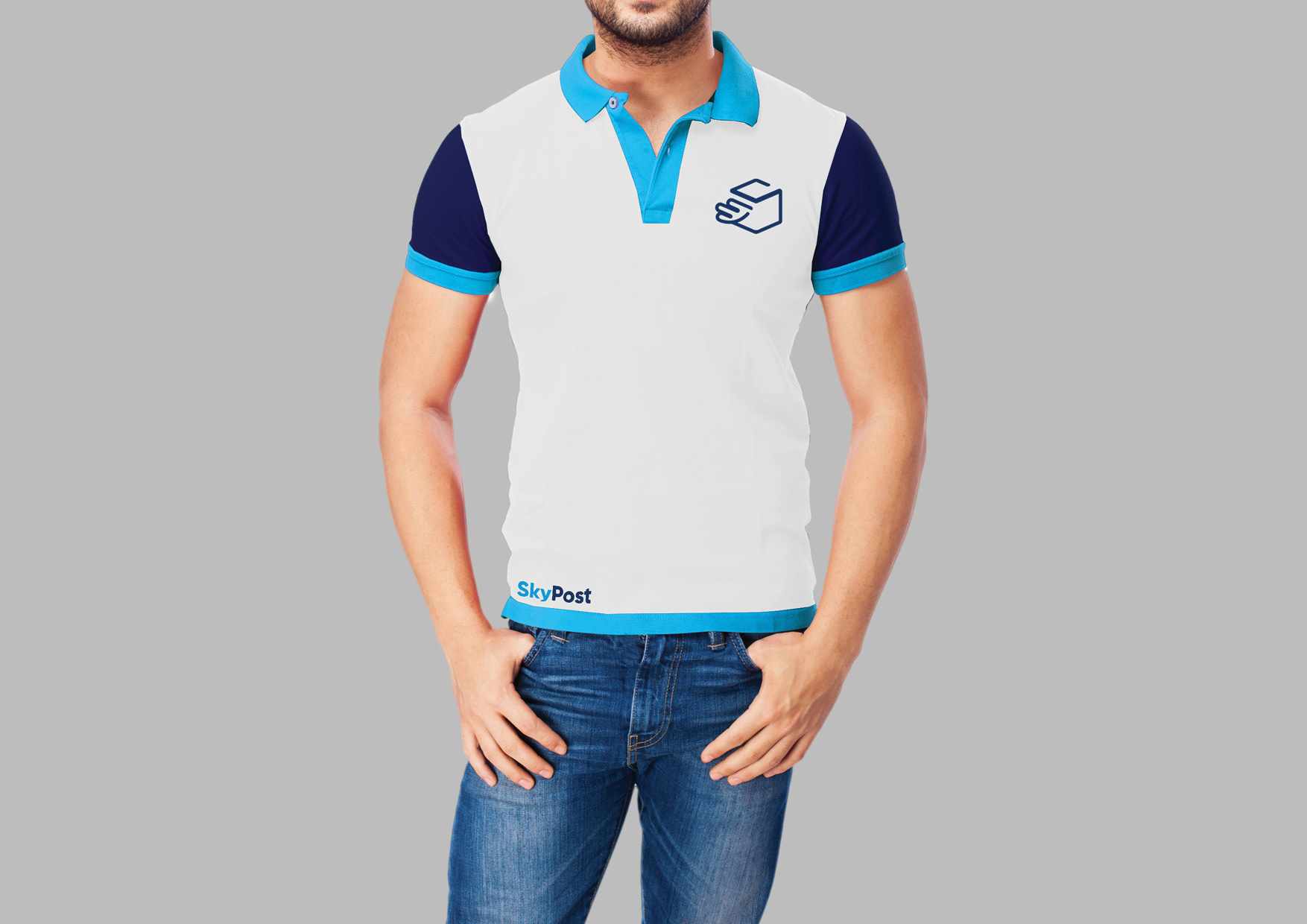
The company’s uniform consists of a polo shirt (with the company’s design) jeans and white tennis shoes.
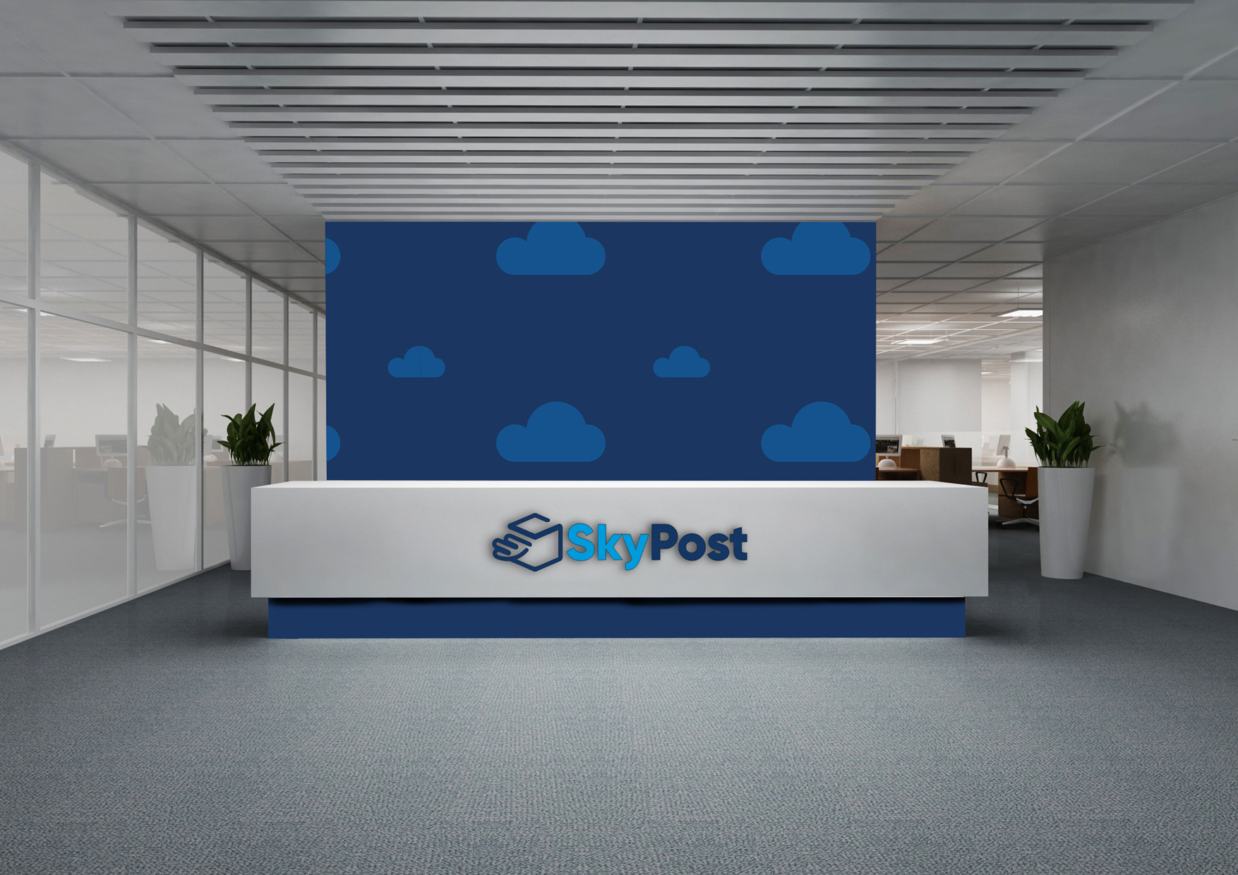
The in-store experience should be the same at all branches. The counter has a blue accent color at the bottom and white in the central area where we will find the logo in the center.
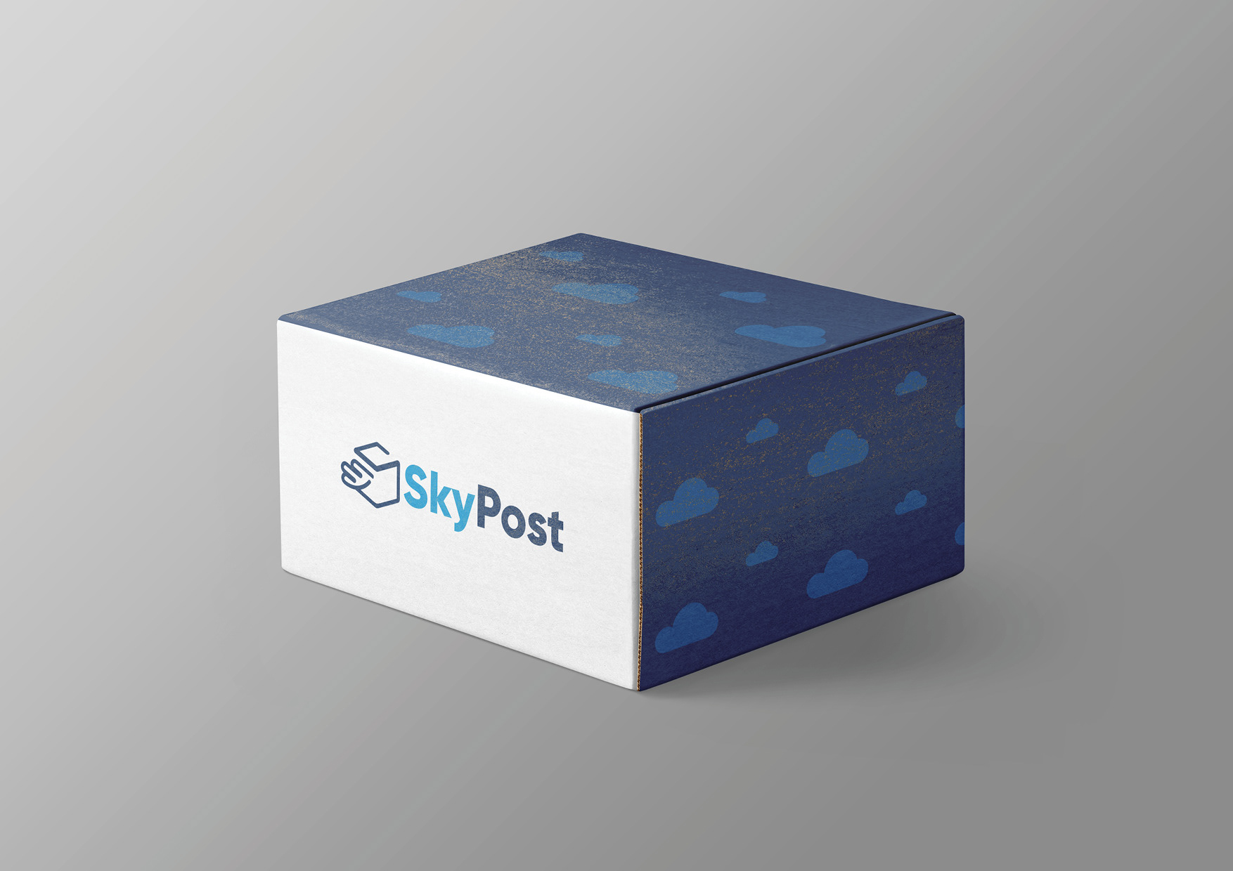
The arrangement of the store’s colors can vary according to the store environment but we must always keep the wall behind the counter, blue with the cloud pattern of the brand.

Software: Illustrator | Photoshop | InDesign