Pablo, the owner of KG Coffees, approached me to update his website and refresh his logo while preserving the brand's original colors and name. His initial attempt at designing the brand's online identity was heartfelt, but it needed more structure to effectively represent his business. Here’s how I approached this project
I reorganized the website for a more intuitive user experience, starting with a streamlined navigation bar featuring sections like Home, Shop, About Us, CoffeeMed, Contact Us, and a dropdown for additional resources. The main page introduces visitors to KG Coffees, their history, and the CoffeeMed program—a community initiative supporting local Guatemalan communities.
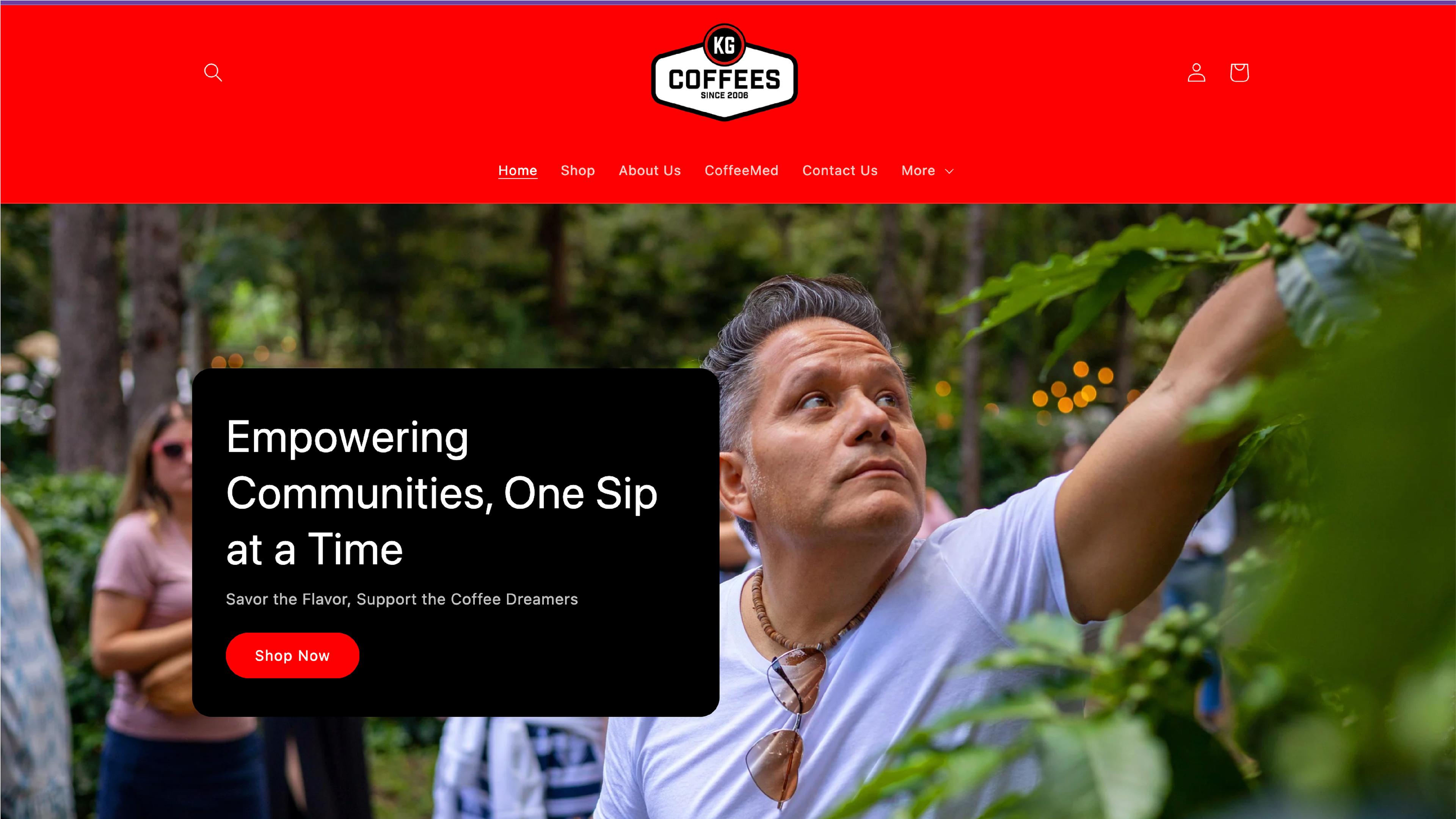
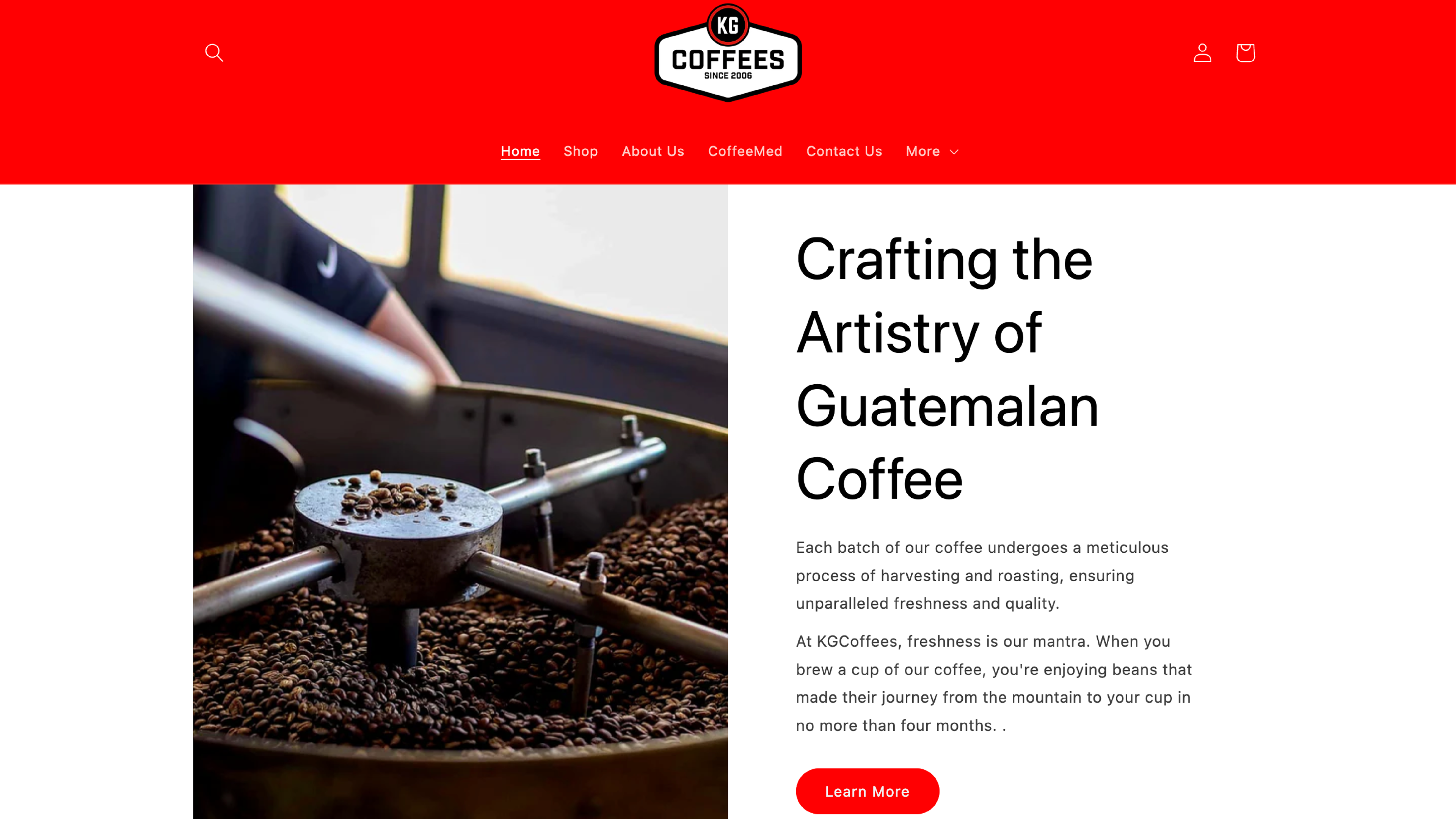
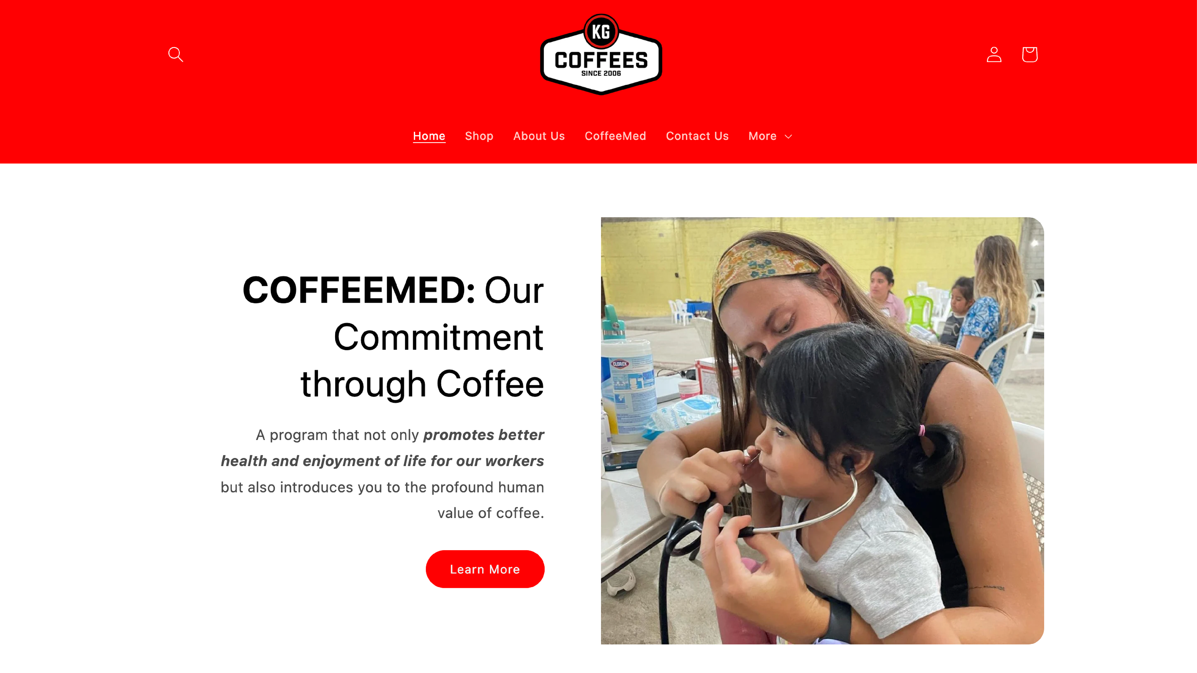
To enhance product visibility, I added clean, consistent white-background product images to each coffee listing, though the cover images have since been updated by the client. Each webpage was carefully restructured with proper titles and subtitles, prioritizing content to improve readability and flow. I also revised all text to better reflect the client’s story and passion, giving it a more inviting and relatable tone.

